
Tim Burton at 68: Why His Worlds Survived the CRT
Tim Burton turns 68 on August 25, 2026. Long before remasters and OLED blacks, many fans first entered his crooked worlds through a rented VHS tape and a softly glowing cathode-ray tube. Those imperfect screens provide a surprisingly useful test: when detail disappears, what remains unmistakably Burton?
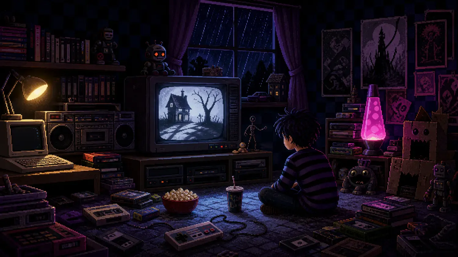
The answer is not one hairstyle, one striped costume or one famous character. It is a system of silhouettes, emotional architecture, handmade texture and visual contrast. It begins with drawing, becomes physical through many collaborators, and survives even when a television blurs the edges.
A birthday seen from the bedroom floor
Burton was born on August 25, 1958, in Burbank, California. Our earlier Tim Burton birthday guide covers the biographical foundation and a selection of essential films. This year’s question is narrower: why did those films feel so powerful in the media environment of the late 1980s and 1990s?
A CRT softened fine lines, VHS added noise, and pan-and-scan editions sometimes reduced a widescreen composition. Yet Beetlejuice, Batman, Edward Scissorhands and The Nightmare Before Christmas remained instantly readable. The technical limitations removed polish but could not erase the core design.
First rule: draw a silhouette that survives
Burton’s images often communicate from the outside in. A narrow tower, an angular doorway, an elongated body or a bare tree can be understood before facial detail becomes visible. That matters on a small screen. Strong contour is visual compression: the audience receives character, mood and movement in a single shape.
The Design Museum’s survey of Burton’s personal archive connected drawings, sketchbooks, moving images, sculpture, set design and costume design. The important point is continuity. A nervous line on paper is not merely decoration made before the film; it can determine how a body leans, how a roof bends and where a shadow cuts through a room.
In a BFI interview, Burton describes drawing and making small Super 8 films as childhood interests. He also explains that animation training at CalArts taught composition and timing because students had to storyboard, animate, shoot and edit. The recognizable image and the rhythm of its movement grew together.
Second rule: make spaces express feelings
Burton’s settings rarely behave like neutral containers. They make an emotion visible. In Edward Scissorhands, the dark mansion and the bright suburb do not simply indicate two locations; they stage the conflict between a vulnerable outsider and a community that prizes cheerful sameness.
The AFI Catalog’s production history records that 44 houses were painted in pastel colors and that some windows were reduced to create unease. It also credits production designer Bo Welch and notes that Edward’s scissor hands were built by Stan Winston’s team from a Burton drawing. The contrast works because design decisions extend from neighborhood scale down to a single prop.
This is why the films remained legible on VHS. Even when color fidelity suffered, the opposition survived: dark against bright, curved against rigid, handmade disorder against suburban repetition. The room itself told the story.
Third rule: let the material show
Stop-motion gives fantasy weight because something genuinely occupied space in front of a camera. A puppet catches light, a miniature wall casts a shadow and a joint moves through tiny increments. MoMA’s essay “Crude Elegance” traces Burton’s early fascination with the technique and explains how its three-dimensional presence helped impossible characters feel real.
VHS noise could actually coexist with that tactility. Slight flicker, visible texture and imperfect movement did not break the illusion; they reinforced the sense that a strange little world had been made by hand. Modern restoration reveals more craft, but the emotional contract was already intact on a family television.
There is no single pair of hands behind “Burtonesque”
Calling every crooked shape “Burtonesque” can hide the production work that turns an idea into a film. The Museum of Modern Art retrospective assembled drawings, storyboards, puppets, maquettes, costumes and film material, and its online record identifies dozens of participating artists. The archive makes the bridge from personal imagination to collective construction visible.
The Nightmare Before Christmas is the clearest reminder. Burton created the story and characters and produced the film, but Disney’s official credit page names Henry Selick as director. Danny Elfman’s music, Caroline Thompson’s screenplay and the work of animators, fabricators, cinematographers and designers are not footnotes to the look; they are how the look became a moving world.
The same principle applies elsewhere. A Burton sketch may establish a vulnerable outline, but production design decides the surrounding geometry, costume translates shape into fabric, lighting gives it depth and performance supplies human timing. Authorship starts the signal; collaboration keeps it strong.
The CRT test still matters in 2026
Today an image may be watched in 4K, compressed into a phone preview, clipped into a vertical feed or reduced to a thumbnail. The delivery systems changed, but the design problem is familiar: can the central idea survive loss?
- Silhouette: can the subject be understood without internal detail?
- Contrast: do the spaces express the conflict before dialogue explains it?
- Texture: does the surface suggest that a world has history and weight?
- Timing: does movement reveal personality rather than merely transport a body?
- Collaboration: do the credits explain who transformed an idea into an object, set, sound or performance?
This is more than retro affection for scanlines and plastic cassette boxes. The bedroom television is a design stress test. Burton’s strongest worlds pass because their emotions were built into shape, space and material before resolution entered the equation.
Conclusion: the picture was never only on the screen
At 68, Tim Burton remains associated with images that people can recognize from a doorway, a shadow or a few crooked lines. Their durability does not come from repeating gothic decorations. It comes from converting a private drawing impulse into clear visual rules, then letting skilled collaborators construct places that feel touched, lit and lived in.
That is why the memory of a dark bedroom and a glowing CRT still fits. The screen was small, the tape was noisy and the world beyond it felt enormous.